The customer chose to protect their confidential information
A Feature-Rich Application for the Globe TV Channel
About the client
Andersen was approached by an international media holding company headquartered in the US. The company asked us to develop an app for their TV channel, which is widely broadcasted across the USA.
![[object Object] on the map](https://static.andersenlab.com/andersenlab/new-andersensite/bg-for-blocks/about-the-client/usa-desktop-2x.png)
Project overview
Andersen was approached by an international media holding headquartered in the US. The company contacted us to develop an application for their TV channel. The channel is widely broadcasted across the Americas. As for Andersen’s role in this IT engagement, our tech experts were entrusted with building a mobile app for Apple TV. This tool enables end-users to watch various shows and other products created by the channel, online and live, via the Second screen technology. Moreover, the resulting application is not just capable of broadcasting and displaying TV content – the design and user interface are tailored-fit and optimized for the Apple TV devices. Finally, this IT project is also successfully integrated with Google Analytics and the customer’s in-house data systems.
IT project deliverables
While working on this IT initiative, Andersen’s expert team was focused on the following three aspects. First, in tech terms, Andersen’s UI/UX experts and software engineers envisioned and built the app itself. It is a full-featured app with intuitive and convenient-to-use interfaces. As a result, it enables end-users to watch HD video content, search for and filter interesting TV shows and products by genres and categories offered by the library. One can also pay for the paid content in one click via the App Store. Second, to properly show targeted ads to users, we integrated the application with the customer’s ad-view analytical systems. Third, to facilitate marketing user research, we ensured reliable integration of the app with Google Analytics.
Project results
- The app reached 320,000 downloads and gained 25,000 active users within the first month of its release;
- The app's integration with both the customer's ad-view analytical systems and Google Analytics has enabled targeted advertising and market research.
Overview
User Flow
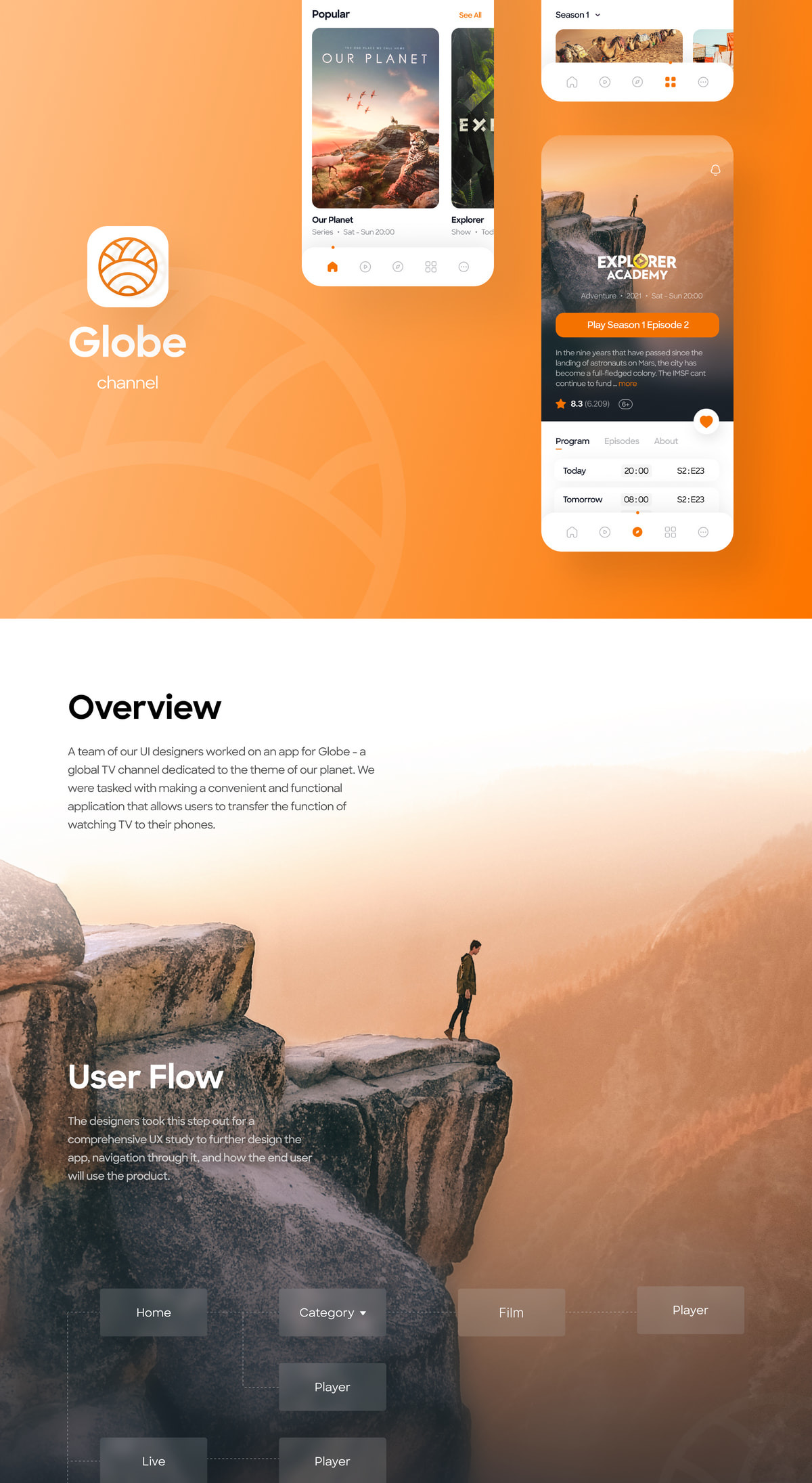
A team of our UI designers worked on an app for Globe - a global TV channel dedicated to the theme of our planet. We were tasked with making a convenient and functional application that allows users to transfer the function of watching TV to their phones.
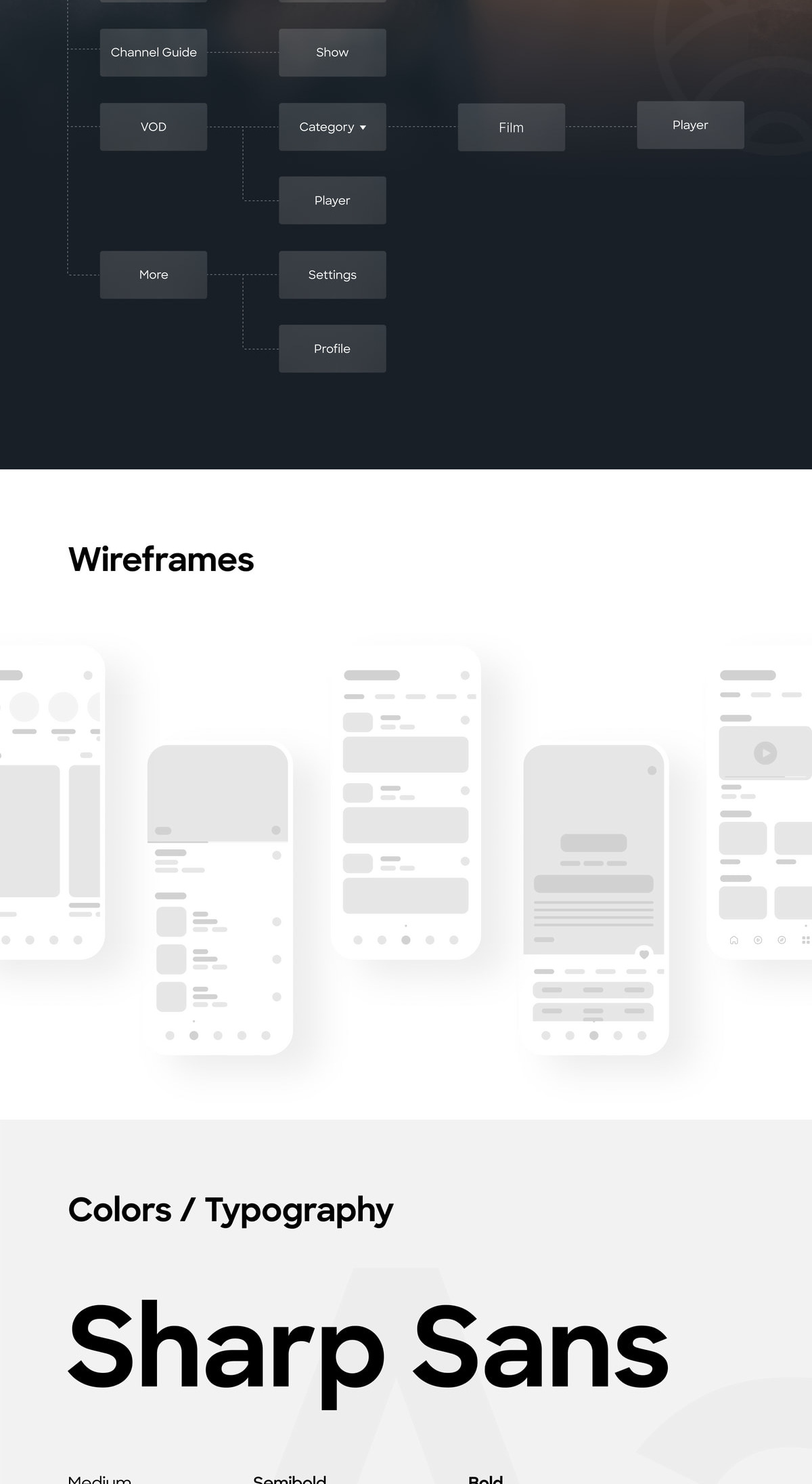
The designers took this step out for a comprehensive UX study to further design the app, navigation through it, and how the end user will use the product.
Home Page
Live
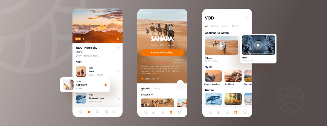
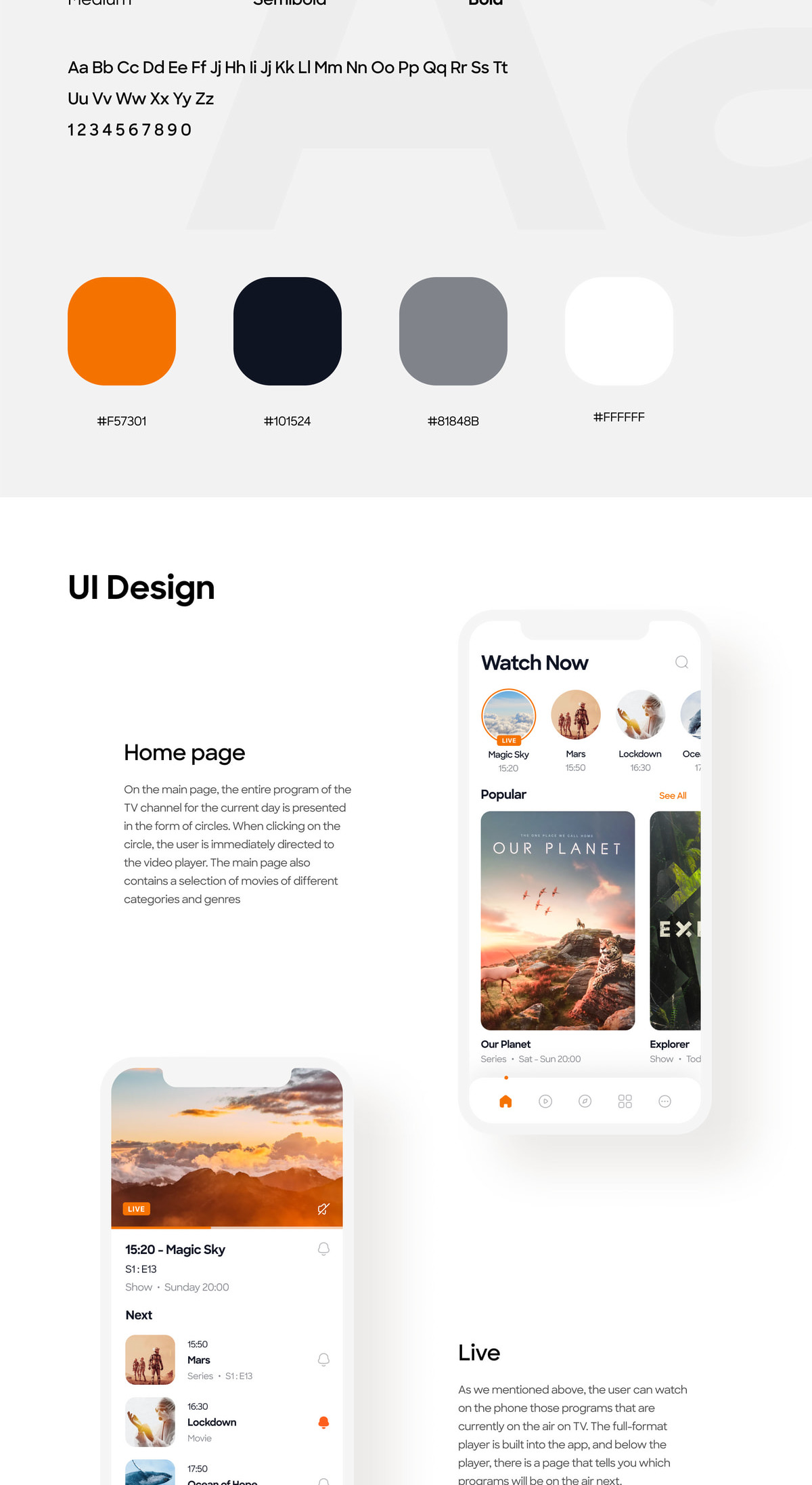
On the main page, the entire program of the TV channel for the current day is presented in the form of circles. When clicking on the circle, the user is immediately directed to the video player. The main page also contains a selection of movies of different categories and genres.
As we mentioned above, the user can watch on the phone those programs that are currently on the air on TV. The full-format player is built into the app, and below the player, there is a page that tells you which programs will be on the air next.
Channel Guide
VOD
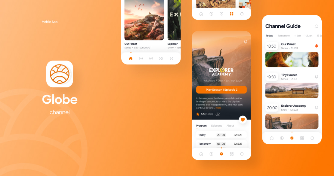
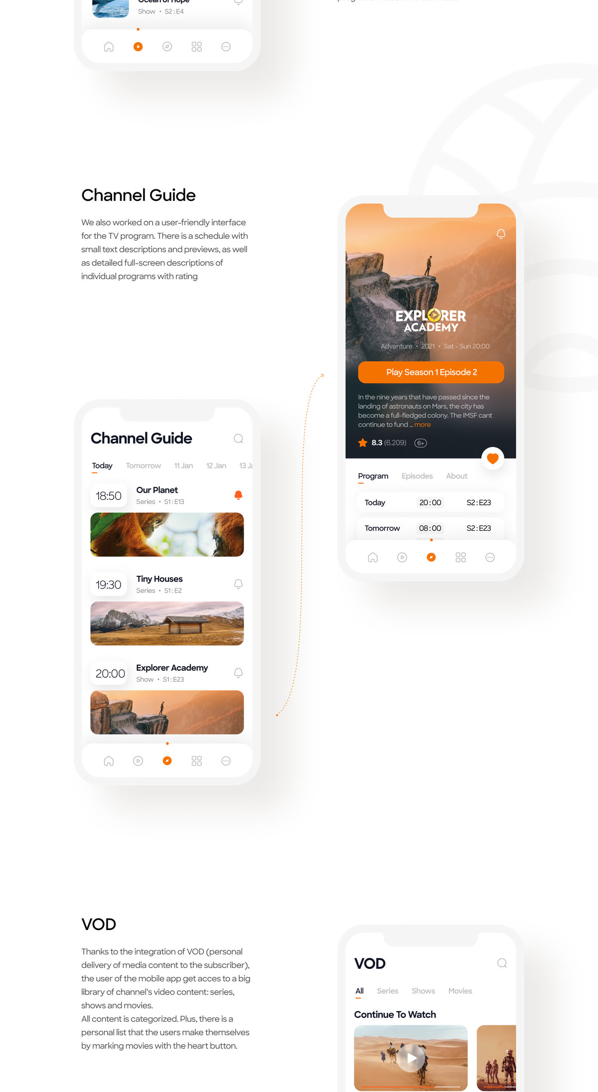
We also worked on a user-friendly interface for the TV program. There is a schedule with small text descriptions and previews, as well as detailed full-screen descriptions of individual programs with ratings.
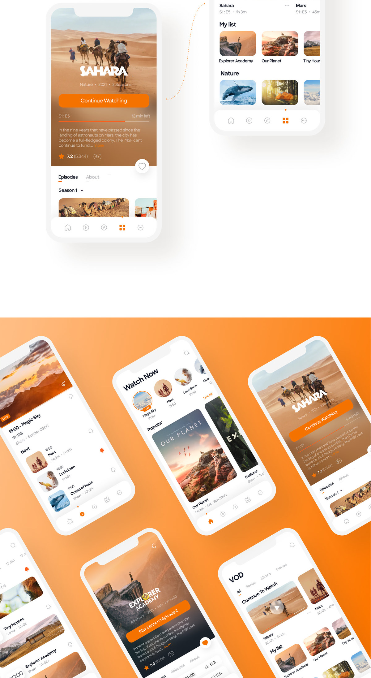
Thanks to the integration of VOD (personal delivery of media content to the subscriber), the user of the mobile app can use the fast rewind programs. There is an opportunity to pause or save the movie on the air in the record. The user can also make a personal list of programs that they want to watch or have already seen. All movies are categorized. Plus, there is a personal list that the user makes themselves by marking movies with the heart button.
Let's talk about your IT needs
What happens next?
An expert contacts you after having analyzed your requirements;
If needed, we sign an NDA to ensure the highest privacy level;
We submit a comprehensive project proposal with estimates, timelines, CVs, etc.
Customers who trust us
