Accounting Department Optimization
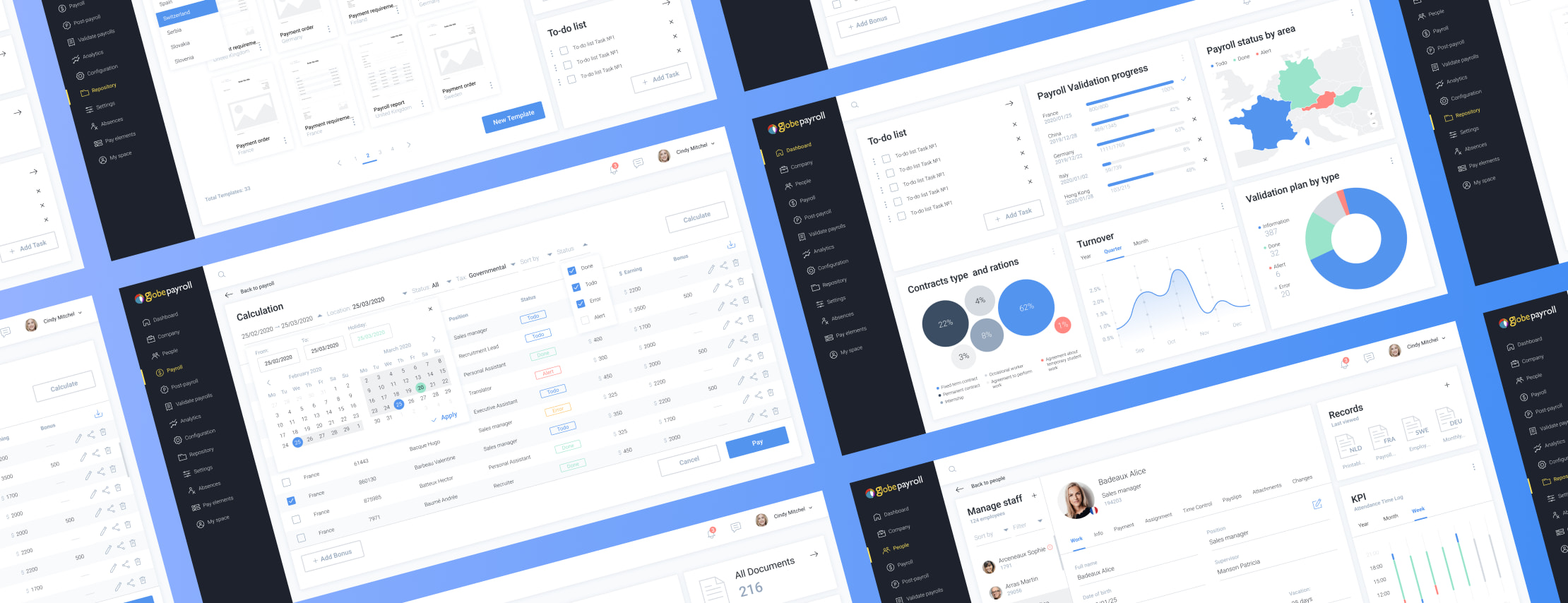
UX research
Before the start of the development process, our team conducted research on the system features. The app is multifeatured and operates with many different entities, which makes the UI rather complicated. Thus, in some cases, a lack of user technical awareness would regularly lead to human errors, inefficient work, and low satisfaction levels. That's why the main focus was to deliver a truly intuitive solution. After a five weeks of dedicated efforts, a high-quality solution was delivered and approved by the customer's staff.
About the client
GlobePayroll is a European company that provides cloud-based core HR and payroll technology for organizations. The Global People Services solution by GlobePayroll provides its clients with an overall view of their personnel and wage costs.
![[object Object] on the map](https://static.andersenlab.com/andersenlab/new-andersensite/bg-for-blocks/about-the-client/france-desktop-2x.png)
UI system
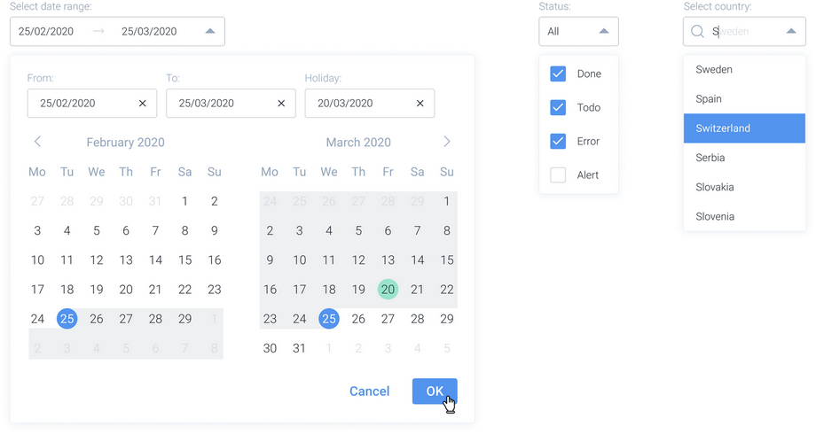
The UI design approach was aimed at keeping everything as simple as possible. Several shades of muted blue were selected as the base colors, while accent colors are more vibrant. The light background is intended not to distract users. Tabs, fields, and buttons were carefully pared down and placed in such a way as to distribute the content evenly, avoiding high-density areas.
Colors

Typography

Buttons

Checkboxes and radio buttons

Iconography

System popups
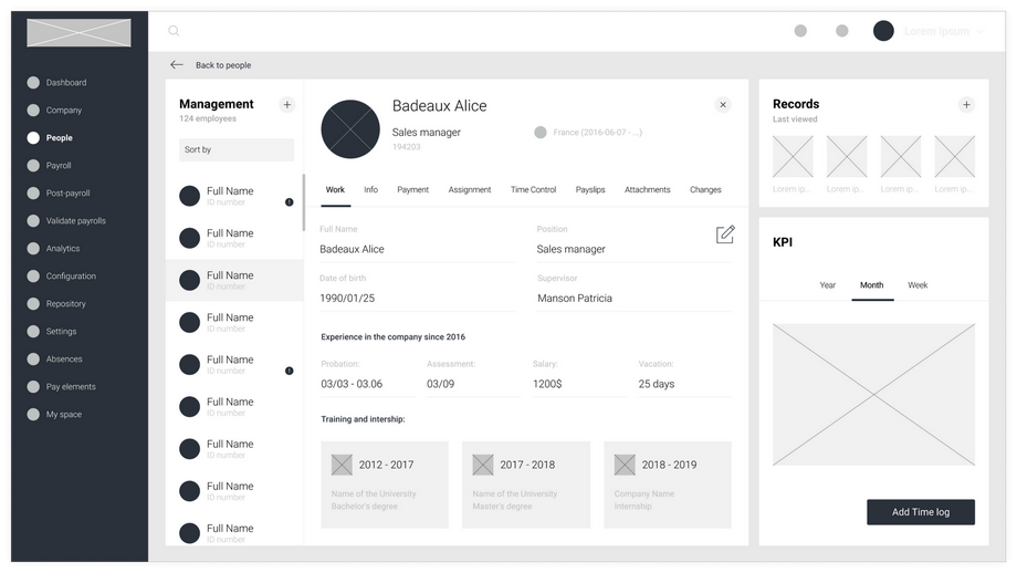
HR module
Proper planning and fine-tuning were the two main credos practiced in our UI design activities. Only real examples of content were used for prototypes. Andersen's experience has shown that this is the only way to understand how the interface will look after delivery.
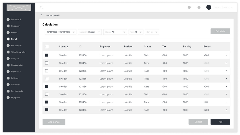
Payroll main module
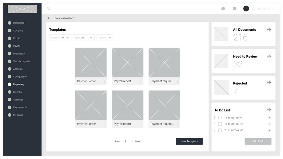
The level of detail for the wireframes was as high as for the finished pages. This helps both the customer and the team be on the same page in their understanding of the UI.
Reporting module
During the wireframing stage, our staff communicated with the customer's team to reveal their needs. This helped to develop a UI that both appeals to the staff and is convenient for the end users.
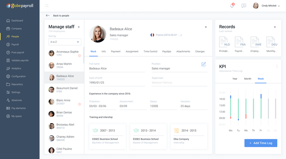
HR module
The central part of the HR module is intended for managing people. There is a full HR dossier with dozens of different data records for each person. The system's in-built tools assist users with each and every activity – from hiring to termination. A calendar and KPI metrics help to monitor the employees' performances. Also, the HR manager can find different document templates here and fill them in with a couple of clicks.
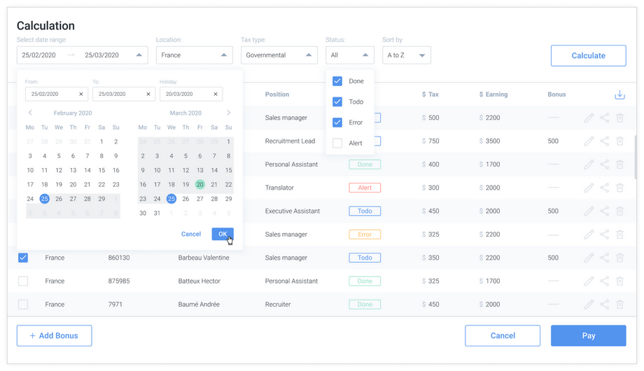
Payroll main module
This module is the most innovative and essential part of the app. Having offices in different locations, the company now has the opportunity to monitor the salaries of its staff on a single screen. It acts as a convenient way to view taxes and deductions, as well as analyze financial dynamics. Based on the data analyzed, authorized users can award bonuses to certain employees, entire workgroups, or even departments, as well as set a day off for the company as a whole or its local office only.
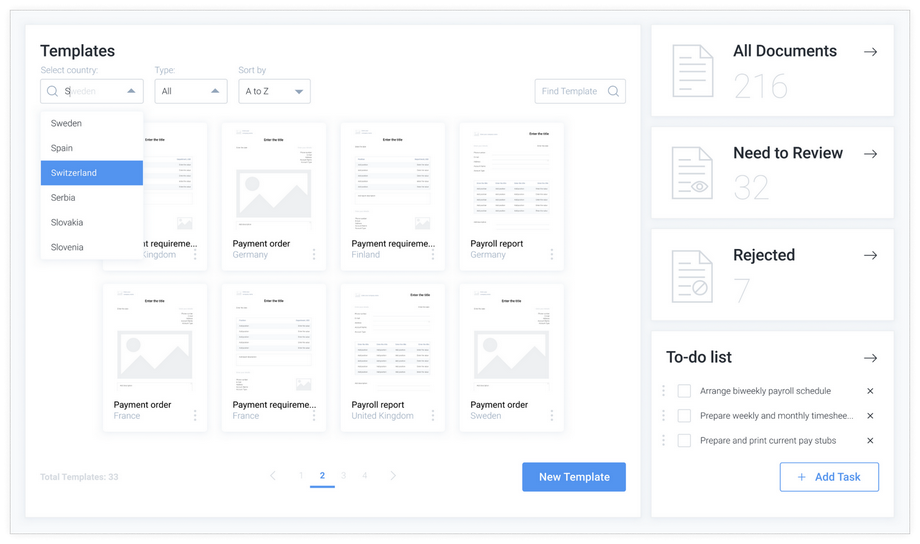
Reporting module
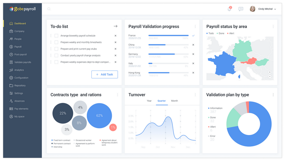
There are different rules and regulations for every country, as well as different formats of records. The user can select the location and then browse through available templates, select the appropriate one, or create a new one. If a document requires urgent consideration, the user will be able to see this from its status. Also, a block with to-do lists was added for better performance.
Business intelligence module
GlobePayroll has built-in powerful business intelligence tools. The user can get access to all the data within the system, then analyze it, and present it in the form of a table or graph. A number of pre-designed dashboards allow users to monitor performance indicators that are essential to HR duties. The access to categories of input data and resulting dashboards is based on user roles and can be reconfigured.
Project results
- Andersen’s experts have successfully delivered a high-quality UI/UX design for this IT project;
- The actual user experience has been optimized, which has helped to lower errors and increase work performance;
- Satisfaction rates associated with applications have risen significantly.
Let's talk about your IT needs
What happens next?
An expert contacts you after having analyzed your requirements;
If needed, we sign an NDA to ensure the highest privacy level;
We submit a comprehensive project proposal with estimates, timelines, CVs, etc.
Customers who trust us
